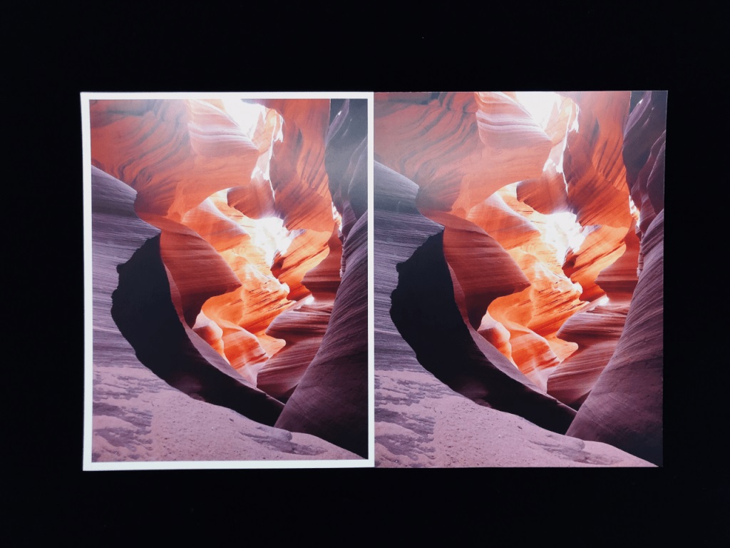
The world of printing and packaging is filled with terms that may sound foreign to those new to it. Today, we’re going to tackle one such term that is crucial to getting your final product to look just right: bleed. It’s not as gruesome as it sounds, promise!
Demystifying ‘Bleed’
In printing, ‘bleed’ refers to an extra margin around your design that extends beyond the final size of your printed piece. But why the need for this extra space? Here’s the simple explanation.
During the printing process, especially for bulk orders, the final cutting of printed items might not always align perfectly with the intended cut lines. This slight misalignment is normal and could result in tiny slivers of unprinted area appearing around the edges of your finished product. Not a great look, right?
Enter ‘bleed.’ By extending your design slightly beyond where the cut will be, you ensure that any slight cutting variances don’t interfere with your design or leave unprinted edges. The result? A polished, professional-looking final product.

Applying Bleed in Your Designs
The standard bleed size often ranges from 3mm to 6mm depending on the printer’s specifications. This means that if you’re designing a 300x280mm custom paper box, your design file should actually be 306x286mm to include a 3mm bleed on each side.

Remember, bleed doesn’t affect your design in any way; it’s essentially a safety net. Anything crucial, like text or logos, should still be within the ‘safe area’ or ‘trim area,’ which is your final desired size (300x280mm, in this example).
It’s crucial to check with your printer for their specific bleed requirements before you start designing. Also, most design software like Adobe Illustrator or InDesign allow you to easily set up bleeds in your document settings.
Bleed in Packaging
Bleed is not only vital in printing but also in packaging. Suppose you’re creating a custom paper box with a beautiful full-color design that extends right to the edges. In this case, you would need to consider bleed to ensure the design fully wraps around the box without leaving unprinted gaps.
Even with die-cut packaging, where the boxes are cut into specific shapes before folding, bleed plays an important role. It ensures the design or color extends all the way to the edge for a seamless look, regardless of minor cutting variances.
Bleed and Your Brand
Why is understanding bleed so important for your brand? Because details matter. Quality printing and packaging reflect on your brand’s professionalism and attention to detail. Understanding concepts like bleed can make a significant difference in delivering a final product that looks and feels high quality.
Whether it’s a business card, brochure, or custom packaging box, using bleed in your design ensures a clean, professional look with no risk of unprinted edges. It’s a small detail in the design process that can have a big impact on your final product.
Wrapping Up
‘Bleed’ may sound like an odd term, but its role in printing and packaging is fundamental. It’s the unsung hero that guarantees your final printed product looks seamless and professional. So the next time you’re setting up a design for print, don’t forget to account for bleed—it’s your secret weapon for a flawless finish.

