

Hey there! Ever found yourself enamored by the shimmering details on packaging or the gleaming text on an invitation? Such allure often boils down to two techniques: “foil stamping” and “metallic Pantone printing.” While they might both dazzle, their essence differs. Ready for a shimmering revelation? Buckle up!
Understanding the Basics
Before we dive deep, let’s get our feet wet. Imagine you’re looking at two shimmering gift boxes. One glimmers like a star in the night sky, while the other has a more subtle sheen, like morning dew on grass. That, my friend, is the difference between foil stamping and metallic Pantone. Intrigued? Let’s break it down further.
What is Foil Stamping?
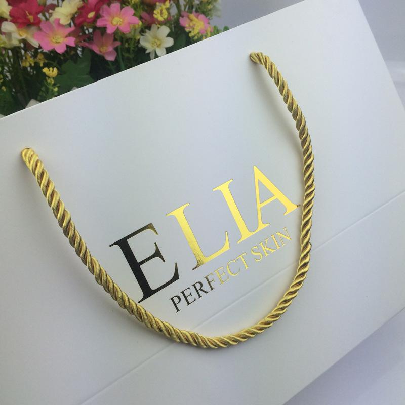
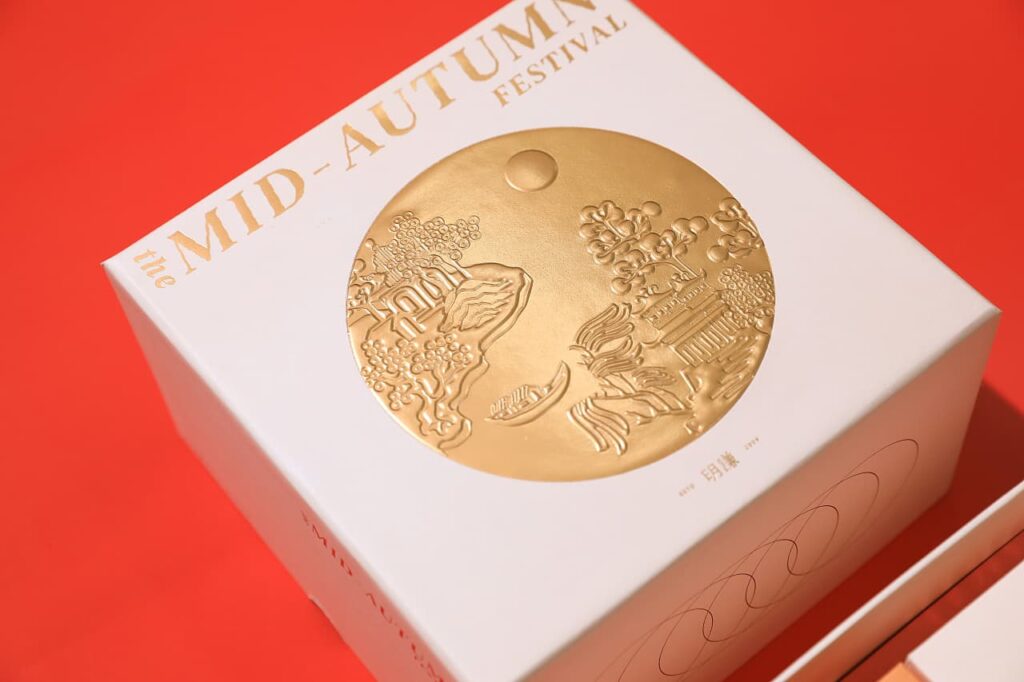
Imagine stamping a piece of gold or silver leaf onto a document. Sounds cool, right? Foil stamping is pretty much that! It’s a special kind of post process where metallic or pigmented foil is applied to a solid surface with heat and pressure. The end result? A design that pops, shines, and literally stands out.
Feeling nostalgic? Think about those greeting cards that glittered and caught your eye instantly. Yep, that’s foil stamping for you!
Characteristics of Foil Stamping:
- Texture: Raised, tactile design due to the pressing process.
- Brightness: Has a very bright, mirror-like sheen.
- Variety: Limited to the available foil colors, commonly gold and silver, but other metallic colors can be found.
Advantages of Foil Stamping:
- Creates a luxurious, high-end finish.
- Provides a tactile feel, enhancing the user’s sensory experience.
- Highly durable and doesn’t fade over time.
Disadvantages of Foil Stamping:
- Generally costlier due to materials and process.
- Limited color options.
- Requires a separate process from standard printing.
Application of Foil Stamping: Perfect for wedding invitations, premium packaging, business cards, and certificates.
Color Selection: Commonly gold, silver, and other basic metallic shades. However, some specialty colors and holographic foils are available.
Metallic Pantone Colors: The Subtle Shine

If foil stamping is the extroverted sibling that demands attention, then metallic Pantone is the introverted, subtle one. Metallic Pantone colors are pre-mixed inks with metallic particles. When printed, they give a smooth, even sheen.
Ever noticed a car with a shiny, metallic paint job? It’s not screaming for attention but still stands out in its unique way. That’s the magic of metallic Pantone for you!
Characteristics of Metallic Pantone Colors:
- Texture: Smooth, even finish.
- Brightness: Subdued shine compared to the dazzling reflectivity of foil.
- Variety: A wide range of colors is available.
Advantages of Metallic Pantone Colors:
- Offers a more diverse range of colors.
- Seamless integration with standard printing processes.
- Generally more cost-effective than foil stamping.
Disadvantages of Metallic Pantone Colors:
- Lacks the tactile, raised feel of foil stamping.
- The sheen may vary depending on the surface it’s printed on.
- Might not appear as luxurious or premium as foil stamping.
Application of Metallic Pantone Colors:
Ideal for product packaging, brochures, posters, and any project requiring a consistent metallic sheen across diverse color choices.
Color Selection:
A plethora of colors! From deep metallic blues to shining rosy hues, you’ve got a vast spectrum to play with.
When to Use What?
Navigating the crossroads of choosing an embellishment? It’s not merely about aesthetic appeal. It’s a dance between the ambiance you envision and the design’s inherent complexities.
Foil Stamping: If you’re envisioning a luxe, high-end feel for things like wedding invites or posh packaging, foil stamping is your go-to. Especially when combined with embossing, which raises the design from the surface, the result is an ultra-luxurious, tactile feel. Imagine running your fingers over a raised, shiny design. Feels sophisticated, right? Conversely, when foil stamping is paired with debossing (an indented design), it creates a subtle, elegant recessed effect. Perfect for certificates or exclusive event invites.
Metallic Pantone: Ideal for a touch of elegance without the added texture. Whether it’s product packaging or corporate brochures, metallic Pantone delivers a consistent sheen.
But here’s the kicker: if you’re contemplating combining metallic Pantone with embossing or debossing, tread cautiously. Registration issues can arise. What does this mean? Getting the alignment just right between the metallic ink and the embossed or debossed areas can be tricky. Even slight misalignments can lead to the design looking off-kilter. So, while the combo promises allure, it demands precision.
Ever considered an artistic fusion? Imagine a canvas painted with Metallic Pantone, adorned with foil stamped motifs. With embossing or debossing in the mix, ensure you’re in the company of maestros who champion perfection.
In a Nutshell…
As our journey winds down, let’s recap. If foil stamping were a flamboyant ball gown, metallic Pantone would be the elegant evening dress. One captivates with its brilliance, while the other enchants with its grace.
So, the next time you stand at the crossroads of design decisions for your paper box, reflect: do you wish to dazzle or to mesmerize? Whatever path you tread, ensure it resonates with your brand’s heartbeat.
Still grappling with choices or looking for expert guidance? We’re here to help. If you need assistance with custom packaging or any design intricacies, feel free to contact us.